
Deploy
Pages
Build custom pages within your portals to display additional information alongside your AI tools.
Within portals, you can create and add pages to display additional information alongside your AI tools. This might include a home page, a pricing page, an about page, or anything else your users might need.
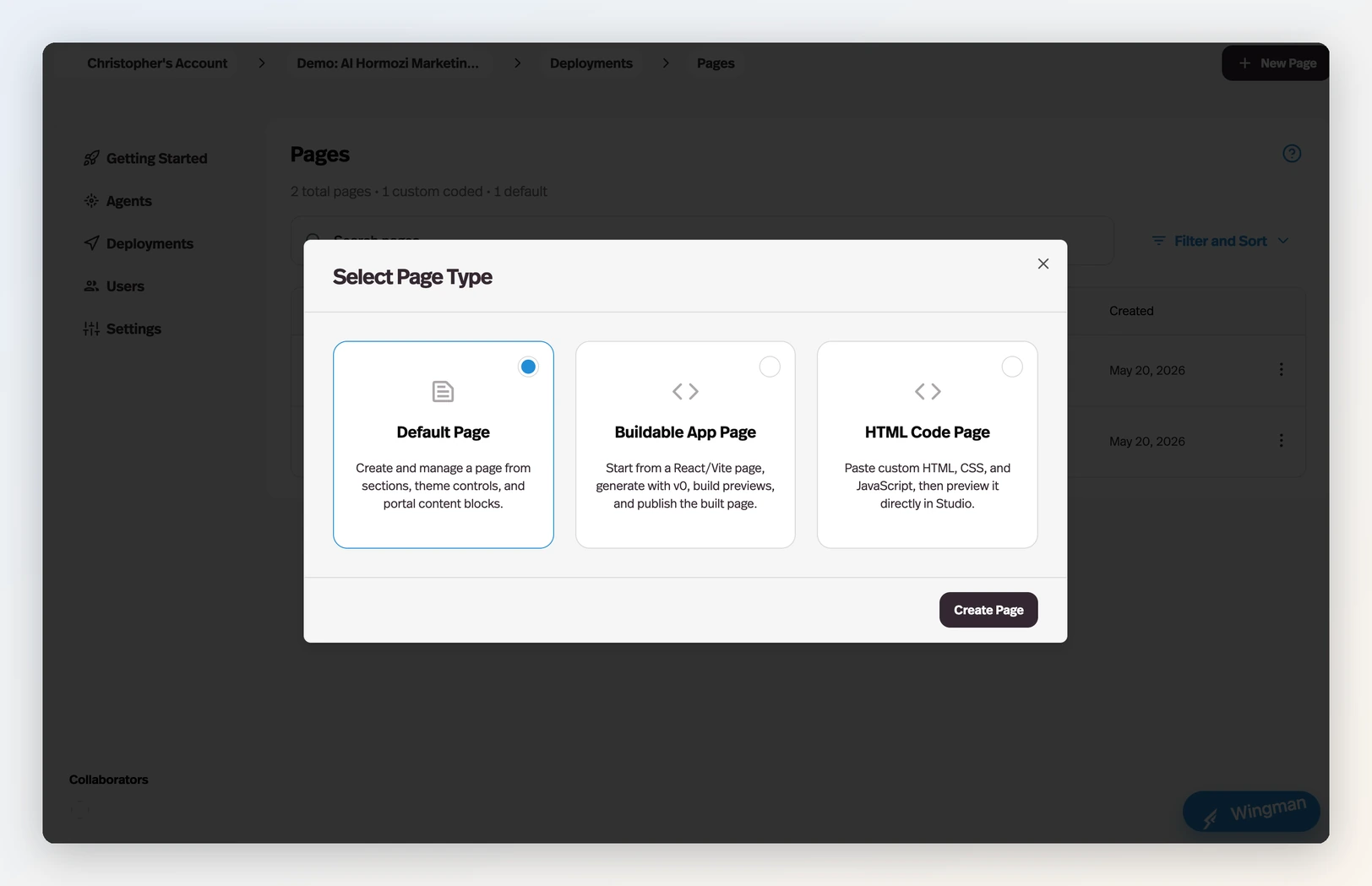
Page types
When you create a page — from the Pages tab, a portal's Add content flow, or Home — Pickaxe asks which kind of page you want:
- Default Page — create and manage a page from sections, theme controls, and portal content blocks. The classic page builder: best for welcome pages, pricing explainers, FAQs, and onboarding content.
- Buildable App Page — start from a React/Vite app and shape it by describing what you want to the built-in AI page builder. Best when the page should do something: calculators, quizzes, interactive dashboards, multi-step flows.
- HTML Code Page — paste custom HTML, CSS, and JavaScript, then preview it directly in Studio. Best when you already have the code.
For the two custom-code types, a Start From template gallery offers ready-made starting points — preview one and click Create from Template, or start blank.
Default pages: the section builder
To create or edit a default page, open it from the Pages tab. Inside a page, you can mix Markdown sections, rich text, and custom HTML. Click Edit Page to make changes and Save Edits to publish.
Hero and text sections
- Hero section — Large text with a call-to-action button, great for landing pages.
- Markdown text block — Write content using markdown formatting.
- Rich text block — A visual editor for formatted text without needing markdown.
Agent and access listings
- Agent listings — Display a collection of your agents for users to browse.
- Access group listings — Show available access groups and their pricing or upgrade paths.
These are especially useful on portal home pages, pricing pages, and upgrade funnels because they let users discover tools and paid tiers without leaving the page.
Footer and utility sections
- Footer section — Add a footer with links, branding, or other closing content.
Custom code pages: describe it, build it, publish it
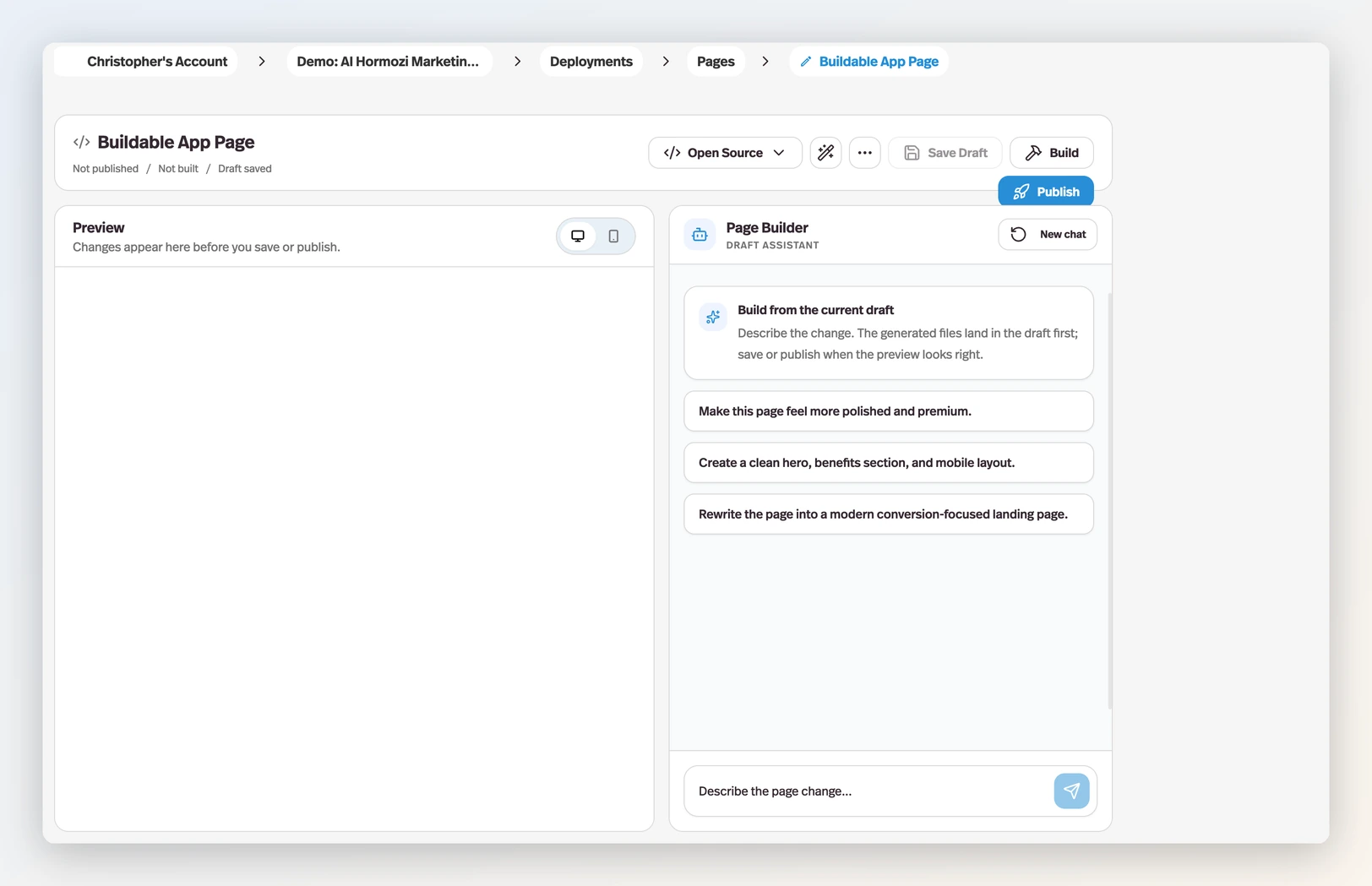
Buildable App Pages and HTML Code Pages share a purpose-built editor with three parts:
- The Page Builder chat (right panel) — describe the page you want in plain English and the AI generates the code into your draft. It works iteratively: "make the hero bolder", "add a three-question quiz that routes users to the right agent", "tighten the mobile layout". Generated changes always land in the draft first — nothing goes live until you publish.
- Source and Preview (left panel) — flip between the code and a live preview, with desktop and mobile views. Buildable App Pages have a full file tree you can edit directly; the Format button keeps code tidy, and you can download or import the whole page as a ZIP.
- The header controls — Save Draft stores your work, Build compiles a Buildable App Page into its final form, and Publish puts the page live. Status chips show where you stand at a glance: Draft saved, Build ready, Published.
Anything you'd normally hand to a developer — interactive calculators, gated content hubs, multi-agent launchers, custom landing pages — can be built this way and live right inside your portal, on your domain, behind your access groups.
Adding pages to a portal
Once you've built your pages, you can add them to any portal through the Content tab in the portal editor, where they'll appear alongside your agents in the side menu. A page's own Portals tab offers the same connection in the other direction — search your portals, select, and confirm.
Common portal page patterns
Builders often use pages for:
- A portal home page that explains what the portal includes
- A pricing or upgrade page that sits next to premium agents
- Onboarding and FAQ content that reduces repetitive support questions
- Resource libraries or lesson content that support the agents in the portal